 Nic Dunn, CEO, Charle Agency

What Separates Good Ecommerce Web Design From Good-Looking Ecommerce Web Design
The best ecommerce web design is judged on two things at once: whether a shopper can complete the job they came to do, and whether they remember who you are afterwards. Most ecommerce websites manage one of those. Very few manage both.
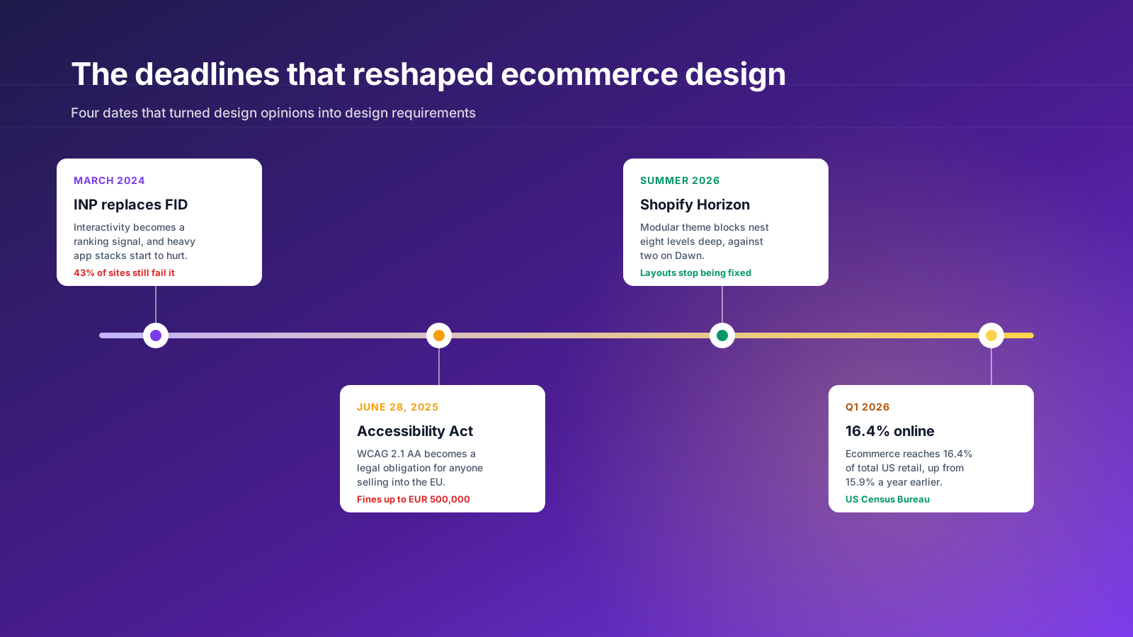
The numbers explain why the gap matters. Ecommerce accounted for 16.4% of total US retail sales in the first quarter of 2026, up from 15.9% a year earlier, according to Census Bureau data. The average US ecommerce conversion rate sits between 2% and 3%. So for every hundred users who arrive on a well-run store, roughly ninety-seven leave without buying. Website design is the lever that moves that number, and it moves it in both directions.
Here is the useful way to think about it. Every design decision on an ecommerce website either reduces the effort required to buy, or increases the reason to buy from you specifically. Reducing effort is craft: fast responsive pages, sane navigation, filters that match how people shop, a checkout that does not ask for a password. Increasing reason is brand: photography, typography, tone, the sense that a real business with a point of view is behind the screen.
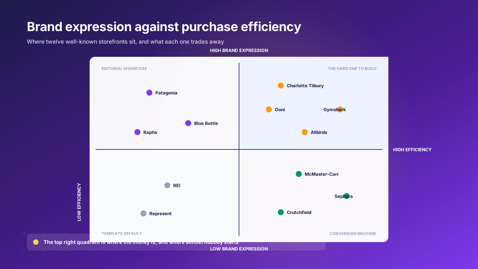
Ecommerce websites that only reduce effort look like every other template. Websites that only increase reason win design awards and lose money. The twelve examples below are chosen because each one solves a specific tension between the two, and because you can copy the decision without copying the aesthetics.
One more framing worth holding onto. Usability, visual design and technology are not three separate workstreams that meet at launch. On an ecommerce website they are the same decision viewed from three angles, which is why the strongest teams in the industry put a designer, a developer and a merchandiser in the same room from the first sketch.
12 of the Best Ecommerce Web Designs and What Each One Gets Right
These are not ranked. Each entry names the standout features worth stealing, the experience they create, and the trade-off that comes with them. Between them they cover fashion, beauty, food and beverage, sports and home, so there should be at least one adjacent to your own industry.
1. Gymshark: quick add and social proof on the same screen
Gymshark built its category pages around impulse. Products carry a quick-add control so a shopper can move an item into the cart without loading a product page, and user-generated content is merchandised on-site under an "As Seen On Social" treatment rather than being confined to a footer feed. The design assumes the visitor already trusts the brand and just needs the shortest possible route from scroll to cart.
The trade-off: quick add works when your catalog has few variants. On a store with complicated sizing, skipping the product page raises returns. Test it on accessories before you roll it across apparel.
2. Charlotte Tilbury: guided selling instead of a search bar
Beauty has a discovery problem, because shoppers often cannot name what they want. Charlotte Tilbury answers it with tools rather than taxonomy: a shade finder, a gift finder, and an image-led mega menu that shows products instead of listing them. The site replicates the counter experience, where an assistant narrows the choice for you.
The trade-off: guided selling tools are expensive to build and need constant merchandising. They pay back on considered purchases with high return risk, and rarely on low-value repeat buys.
3. McMaster-Carr: search and taxonomy as the primary interface
McMaster-Carr sells hundreds of thousands of industrial parts to people who arrive knowing exactly what they need. The design leans into that with predictive search, a strictly hierarchical navigation, and visual category filters that let an engineer identify a fastener by shape. The site looks plain and is one of the most sophisticated pieces of ecommerce UX in the country.
The trade-off: heavy investment in search only makes sense past a few hundred SKUs. Below that, good category structure does the same job for less.
4. Patagonia: visual storytelling that survives the category page
Plenty of brands tell a story on the homepage and abandon it the moment a shopper reaches a listing. Patagonia carries it through with immersive scrolling, image-led navigation and infinite scroll on category pages, so the environmental narrative is still present at the point where most sites revert to a bare grid. Color swatches and advanced filters sit alongside it rather than replacing it.
The trade-off: infinite scroll makes it harder for shoppers to return to their place, and it complicates analytics. Pair it with a persistent filter bar and a clear count of results.
5. Ooni: education before the transaction
Ooni sells a product most buyers have never used. The site solves that with a dedicated educational area, a "what's in the box" graphic, and deliberate use of color to lead attention through the explanation before the price appears. The buying decision is made during the learning, not during the checkout.
The trade-off: education-first layouts push the add-to-cart control further down the page. Keep a sticky purchase bar so ready buyers are never trapped in the story.
6. Allbirds: material transparency as the value proposition
Allbirds made sustainability the product rather than a badge. Material education runs through the entire shopping journey, not just an About page, and the visual language stays quiet enough that the claims read as fact rather than marketing. Generous white space, natural lifestyle photography and benefit-focused copy do the persuading.
The trade-off: this only works if the underlying claims survive scrutiny. Transparency as a design strategy is a commitment to being transparent.
7. Rapha: the membership layer as an information architecture problem
Rapha runs a retail store, an editorial publication and a paid membership through one experience. The navigation treats those as peers rather than burying two of them, so a shopper can enter through a jersey and leave having joined the club. The design earns its complexity by making each layer reinforce the others.
The trade-off: multi-proposition navigation is the single most common place where large stores get bloated. Every extra top-level item costs attention from the ones that sell.
8. Represent: scarcity mechanics built into the interface
Represent, the British luxury streetwear label, runs a Vault Sale system and stock alerts by email and SMS, both surfaced in the design rather than tucked into an app widget. Urgency is treated as a first-class interface element, with high-contrast product photography and heavy uppercase typography carrying the tone.
The trade-off: scarcity signals only work when they are true. Fake countdown timers and permanent "low stock" badges train shoppers to ignore every badge you show them.
9. Sephora: seasonal merchandising without a rebuild
Sephora reshapes the look of its storefront around trading moments, alongside strong search and the Beauty Insider loyalty program surfaced throughout the experience. The lesson is architectural: the design system was built so a merchandising team can change the feel of the site without a development sprint.
The trade-off: that flexibility has to be designed in from the start. Retrofitting a takeover capability onto a rigid theme is usually more expensive than the rebuild.
10. Crutchfield: specification depth as a trust signal
Crutchfield sells car and home audio equipment where compatibility is the whole purchase decision. The site provides workshop-level detail, a vehicle fit tool, comparison tables and specification depth placed exactly where the doubt occurs, backed by advisors the buyer can reach. Nothing important is hidden behind a specification tab.
The trade-off: specification-heavy pages get long. Use anchored sub-navigation inside the product page so a shopper can jump to the section that answers their objection.
11. Blue Bottle Coffee: subscription as the default path
Blue Bottle Coffee, the Oakland specialty roaster, designs for repeat purchase rather than first purchase. Subscription options are presented as the primary route with one-off orders as the alternative, and an editorial content hub of brewing guides and coffee stories keeps the relationship alive between deliveries.
The trade-off: leading with subscription raises the commitment required at the first purchase. Offer a genuinely easy pause and skip, and say so on the product page.
12. REI: the proposition surfaced in the navigation
REI puts used gear, trade-in and repair services into the top-level navigation rather than the footer, which turns a values statement into a shoppable service. It also gives returning members a reason to visit that is not a discount code.
The trade-off: promoting a service to top-level navigation means resourcing it. A repairs link that leads to a contact form damages more trust than it builds.
Read across those twelve and a pattern appears. None of them won on visuals alone. Each one identified a specific friction in its own shopping experience and designed a feature to remove it, then let the aesthetics express what kind of business was doing the removing. That order is the whole lesson.
For a wider view of who is building well on the platform, our roundup of the biggest brands on Shopify and our list of top clothing stores on Shopify cover more fashion and lifestyle examples in depth.
The Visual Layer: Photography, Typography and Brand Elements
Most articles about the best ecommerce websites stop at describing the aesthetics. That is the wrong order. The visual layer is the last thing you should design and the first thing shoppers judge, so it needs to be built on decisions that have already been made about who you sell to and how they shop.
Photography is the single biggest visual investment
Product photography carries more weight on an ecommerce website than any other design element, because it is the only thing standing in for the physical product. The brands with the strongest visuals treat photos as a repeatable system rather than a seasonal shoot: a fixed crop, a consistent background, a scale reference in at least one frame, and lifestyle imagery that shows the product in the situation the customer imagines using it.
Fashion retailers face this hardest, because fit and drape cannot be inferred from a flat-lay. The better fashion ecommerce websites shoot on multiple body types, include a model height and size note, and use short video clips on the product page so a shopper can see how a garment moves. Video does more work than a fifth still photo for anything with texture, weight or movement.
Typography carries the brand when photography cannot
Typography is where a lot of ecommerce websites quietly fail. A typeface chosen for a homepage headline often falls apart at 13px in a specification table, and a brand that relies entirely on a distinctive display face has nothing left when it reaches a checkout process. Pick a pairing early: one voice for expression, one workhorse for interface elements, both tested at the small sizes where most of the reading actually happens.
The practical rules are dull and worth following. Body copy at 16px minimum on mobile. Line length capped around 70 characters. Line height around 1.5 for paragraphs. A contrast ratio of at least 4.5:1 so the type survives a phone screen in daylight.
Branding is what makes the visuals mean something
Branding on an ecommerce website is not a logo placement exercise. It is the accumulated consistency of color, type, tone and imagery across every template, including the ones nobody designs: the search results page, the empty cart, the sold-out state, the order confirmation email. Those are the pages where most stores revert to platform defaults and lose the thread.
Different styles suit different categories. Minimal, gallery-led aesthetics work for considered purchases where the product is the argument. Denser, more editorial layouts work where the community and the content are part of the value. Neither is inherently better. What matters is whether the style you chose is the one your customers respond to, which is a question with a testable answer rather than a matter of taste.
The Design Patterns Every High Performer Shares
Strip away the aesthetics and the same seven decisions appear across every store on that list.
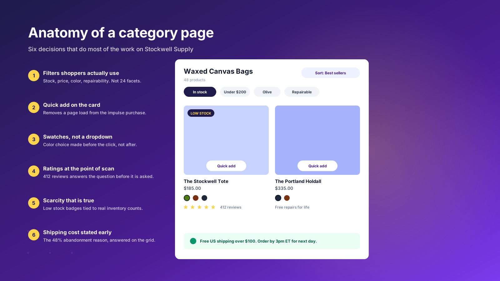
The cost of shipping is stated before the cart. Unexpected extra costs are the single biggest reason people abandon carts, cited by 48% of shoppers. Every strong storefront answers the shipping and tax question on the category page or in a persistent bar, not three steps into checkout.
Product photography is treated as infrastructure. Not a shoot, a system: consistent crop, consistent background, a scale reference, and at least one image of the product in use. Weak photography cannot be rescued by good layout.
Navigation is shaped by demand, not by the org chart. Categories reflect what people search for, which is often not how the business files its stock. A useful test is to compare your top-level menu against your top fifty internal site search terms.
Reviews appear at the moment of doubt. On the category card for scanners, near the price for comparers, and near sizing for the anxious. Burying all social proof at the bottom of the product page wastes it.
Variants are shown as swatches. A color dropdown forces a shopper to imagine the option. A swatch shows it. This is a small change with a measurable effect on click-through from listings.
The checkout asks for as little as possible. Forced account creation is the second most cited reason for abandonment at 26%, and a complicated checkout is third at 22%. Guest checkout and a single-page flow are not optional refinements. If you are on Shopify, our guide to Shopify one-page checkout covers what you can and cannot change.
Everything is measured. The strongest teams do not argue about design in meetings, they run the variant. Our guide to A/B split testing covers how to set that up without corrupting your data.
There is an eighth pattern that sits underneath all of them: these teams treat SEO and design as one project rather than two. Heading structure, internal linking between categories, image optimization and page templates are design decisions with direct SEO consequences, and the stores that separate the two end up with beautiful pages nobody can find. Engagement metrics follow the same logic, because time on page and return visits are downstream of whether the interface was pleasant to use. Our Shopify SEO guide covers where the two disciplines overlap most.
Usability and the UX Details That Decide Sales
UX is the part of ecommerce web design that nobody screenshots and everybody feels. A user-friendly interface is not a style, it is the absence of a hundred small frictions, and the stores that convert best have removed most of them.
The details that most stores get wrong
Start with the ones that show up in almost every audit we run. Search that returns nothing for a plural or a misspelling. Filters that reset when a visitor uses the browser back button. A cart drawer that closes and dumps users back at the top of a category. Size guides hidden behind a modal that does not work on mobile. A sold-out variant that gives no route to a restock alert. None of these are visible in a design file, and all of them cost orders.
Customer reviews deserve their own note. Most stores install a reviews app, drop the widget at the bottom of the product page, and never look at it again. The better shopping experience surfaces the ratings on category cards where visitors are scanning, pulls the two or three most useful review details up near the specifications, and lets people filter reviews by the attribute they are worried about. Our roundup of the best reviews apps for Shopify covers which tools support that properly.
Usability testing beats usability opinion
Five people attempting a real task on your ecommerce website will tell you more than a month of internal debate. Give them something concrete: find a gift under $75 for someone who cooks, or work out whether an item can be returned free. Watch where they hesitate. The hesitations are your backlog.
Then check the same journeys in your analytics. Internal site search terms with no results, product pages with high traffic and low add-to-cart, and the exact step in the checkout process where sessions end. Those three reports usually identify the highest-value UX work in an afternoon.
Design for the states nobody designs
A design system is only finished when it covers the awkward moments. What does a category with three products look like? What happens when a promotion ends mid-session? What does the interface show when a payment is declined? These states are where a well-designed ecommerce website separates itself from a good-looking one, because they are where real users end up and where the technology usually shows through.
Mobile Is the Design, Not a Version of It
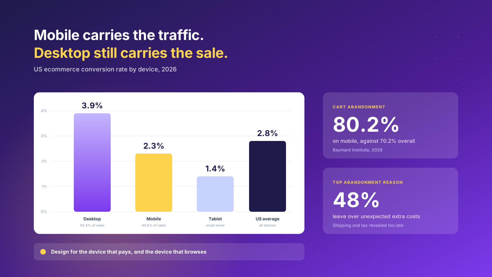
Mobile accounts for roughly 44.6% of US ecommerce sales and converts at around 2.3%, against 3.9% on desktop, despite carrying a far larger share of the traffic. That gap is not a fact of nature. It is the accumulated cost of designing on a large screen and adapting downwards.
Cart abandonment tells the same story. Mobile abandonment runs around 80.2% and tablet around 80.7%, against roughly 70% on desktop. Something in the mobile journey is losing people who had already decided to buy, and it is usually one of four things: a form that fights the on-screen keyboard, a payment method that requires typing a card number, a shipping cost that appears late, or a product page where the add-to-cart control scrolls away.
The practical fix is to design the mobile layout first and treat desktop as the expansion. That forces the hard prioritization calls early, because you cannot fit six competing modules above the fold on a 390px screen. Whatever survives that constraint is what actually matters.
Three specifics worth checking on your own store today. Is your primary add-to-cart control sticky on mobile product pages? Are Apple Pay, Google Pay and Shop Pay presented before the manual card form rather than after it? Does your mega menu collapse into something a thumb can operate one-handed, or does it become a scrolling wall of links?
Our guides to Shopify mobile responsive web design and optimizing a Shopify store for mobile go through the implementation detail.
Speed Is a Design Constraint, Not an Engineering Afterthought
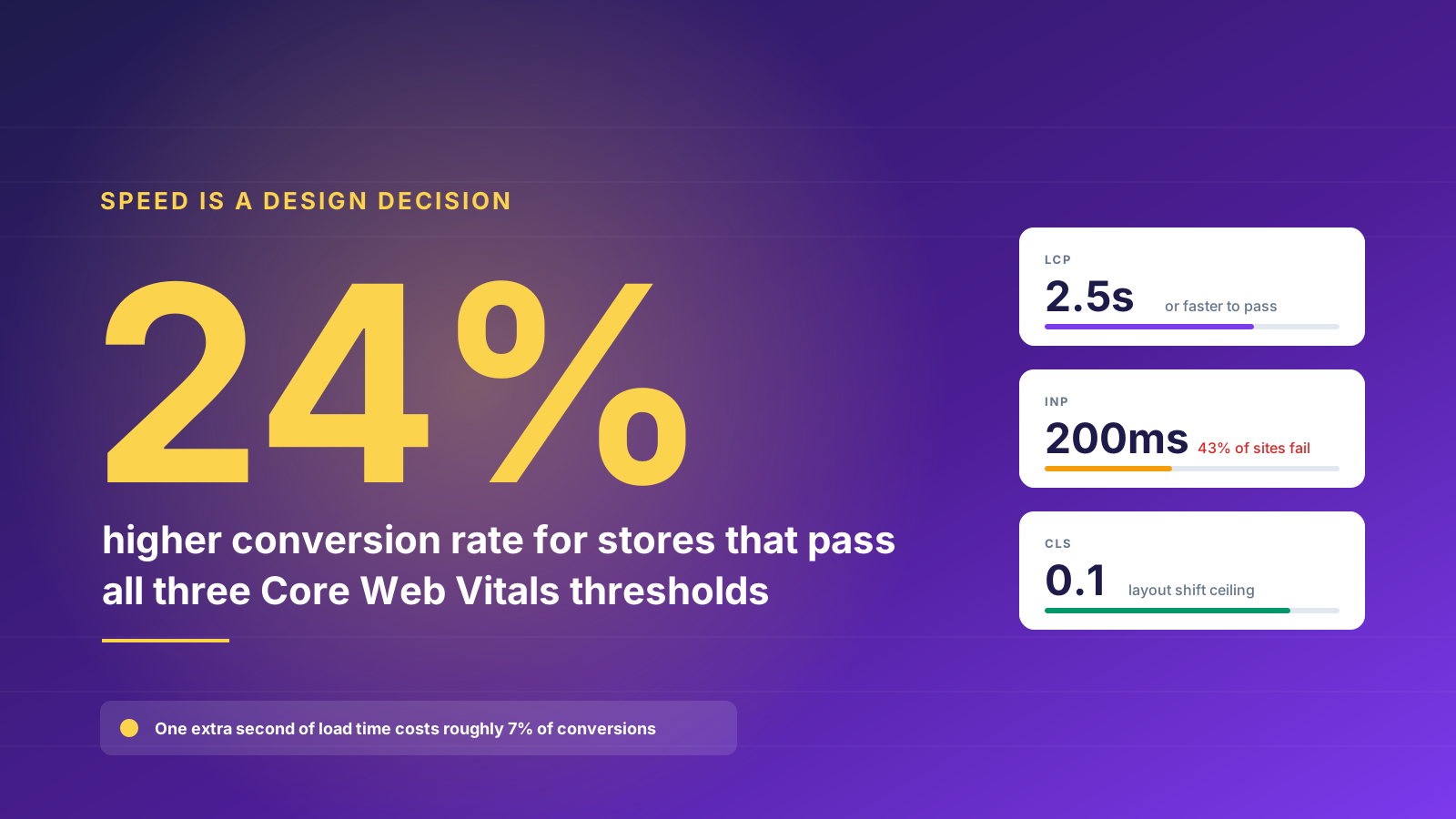
Stores that pass all three Core Web Vitals thresholds convert around 24% better than stores that do not. A single extra second of load time costs roughly 7% of conversions. Those numbers make performance a design brief, because most of what slows an ecommerce site down is a design decision made without a performance budget.
The three metrics that matter are Largest Contentful Paint, which should land under 2.5 seconds and measures how quickly the main content appears; Interaction to Next Paint, which should stay under 200ms and measures how quickly the page responds when someone taps something; and Cumulative Layout Shift, which should stay under 0.1 and measures how much the page jumps around while loading.
Interaction to Next Paint replaced First Input Delay in 2024 and is now the most commonly failed of the three, with around 43% of sites missing the threshold. It is also the one design causes most directly. Every review widget, currency selector, chat bubble and personalization script competes for the same main thread, and the shopper feels it as a tap that does nothing.
Sector leaders including Amazon, Zalando and ASOS hold a median LCP below 1.8 seconds, CLS below 0.04 and INP below 150ms. Those are achievable numbers on Shopify if performance is a constraint from the first wireframe rather than a clean-up task before launch.
The design practices that help most are unglamorous. Reserve explicit space for images and embeds so nothing shifts. Cap the number of third-party scripts and audit them quarterly against revenue rather than against enthusiasm. Load below-the-fold imagery lazily. Serve modern image formats. Prefer a native theme feature over an app whenever the two do the same job.
Accessibility Stopped Being Optional in 2025
US retailers already face ADA Title III exposure, and web accessibility lawsuits against ecommerce businesses have run into the thousands each year. On top of that, the European Accessibility Act has applied to ecommerce services sold to EU consumers since June 28, 2025, and enforcement has been building through 2026. It applies to any provider selling into the EU regardless of where that provider is based, so a US brand shipping to Europe is in scope. The technical standard is WCAG 2.1 AA, referenced through EN 301 549, and penalties in some member states reach €500,000.
Compliance is not only a technical exercise. Retailers in scope also need a published accessibility statement and a documented process for maintaining conformity.
The design implications are concrete and mostly cheap if handled early. Text needs a contrast ratio of at least 4.5:1 against its background, which rules out the pale gray body copy that looks refined in a design tool and disappears on a phone in daylight. Every interactive element needs a visible focus state. Form fields need persistent labels rather than placeholder text that vanishes when typing starts. Images need meaningful alternative text. Nothing important can be communicated by color alone, so an error state needs an icon or a message as well as a red border.
Retrofitting these onto a finished design costs several times what it costs to build them in. The brands that treated the deadline as a design brief rather than a legal problem generally ended up with clearer interfaces for everybody.
Ecommerce Web Design Across Platforms
The platform you build on sets the ceiling on what your design team can do without a developer. That constraint matters more over three years than any decision made in the first wireframe, because a design your merchandisers cannot change is a design that decays.
Shopify and Shopify Plus
Shopify carries most of the well-designed ecommerce websites in this article, and the design freedom improved materially with the Horizon themes released in the Summer 2026 edition. Horizon replaced the fixed layouts of earlier templates with modular theme blocks that nest up to eight levels deep, against two on Dawn, and added group blocks for bundling related elements such as headers, product grids and promotional banners into one manageable unit. In practice that means a merchandising team can restructure a page without touching Liquid.
Shopify Plus adds checkout customization, B2B functionality, multiple storefronts and higher API limits. Our comparison of Shopify against Shopify Plus sets out where the line falls, and editing the Shopify checkout covers what is possible on each tier.
Magento and Adobe Commerce
Magento, now sold as Adobe Commerce, still appears across a lot of established retailers, particularly those with complex catalogs and long-standing ERP integration. The design trade-off is real: near-total control over templates and features, paid for with a development cost on every change and a hosting and maintenance burden that a small team feels immediately. Many of the retailers listed in older best-of roundups were built on Magento and have since moved.
WooCommerce and WordPress
WooCommerce on WordPress suits content-led brands where the blog, the community and the editorial output genuinely drive the business and the catalog is modest. The design freedom is high and the cost of entry is low. The costs arrive later, in plugin conflicts, performance work and security maintenance, all of which land on whoever owns the ecommerce website rather than on a platform vendor.
BigCommerce and the composable route
BigCommerce is the usual alternative for catalogs with complicated B2B pricing, customer groups and price lists, and it supports headless builds where the storefront is decoupled from the commerce engine. Composable and headless architectures buy the most design freedom of any option and cost the most to maintain, so they make sense when content and commerce genuinely need to be separate rather than when a team simply wants a faster site. Our comparison of Shopify against BigCommerce covers the detail.
One rule holds across all of them. Whatever platform you choose, the design system has to be operable by the people who work on the store every day. A beautiful build that requires a developer for a homepage banner change will be worked around within a quarter, and the workarounds are what visitors see. Judge platforms on the quality of the customization you can perform without a deployment, not on the size of the template library.
Where Inspiration Galleries Let You Down
Search this topic and the first page of Google is mostly galleries: Awwwards, CSS Design Awards, siteinspire, Dribbble, ecomm.design, Land-book. They are genuinely useful for one job, which is finding a visual direction quickly. They are close to useless for three others.
They select for novelty rather than trade. An award-winning ecommerce website is judged on craft and originality by a jury of designers, not on revenue per session by the finance team. The two correlate less often than the industry likes to admit, and the websites that photograph best are frequently the ones carrying the heaviest animation load and the worst usability under load.
They show a moment, not a system. A screenshot of a homepage tells you nothing about how the design copes with a product that has eleven variants, a category with four items, a sold-out size, or a customer service banner during a carrier delay. Most of the real work in ecommerce website design lives in those edge states, and none of it makes a portfolio.
They rarely say what platform anything is built on, what technology sits behind it, or what it cost. Dribbble in particular shows concepts that were never built and often could not be, because they assume no cart drawer, no cookie banner, no third-party review widget and no sales tax. A case study from an agency is more useful than a gallery entry for exactly this reason, since it usually states the platform, the constraints and at least one result.
Use galleries for the mood board. Use live ecommerce websites, opened on your own phone on a poor connection, for the decisions. Then check the ones you admire in a performance tool before you copy their approach, and look at their category pages rather than their homepages, because that is where visitors actually spend their time.
How to Brief an Ecommerce Web Design Project
The gap between a good brief and a bad one is usually worth more than the gap between two agencies. A brief that names the commercial problem gets a design that solves it. A brief that names a competitor gets a copy of that competitor.
Start with the numbers you want to move. Conversion rate by device, average order value, revenue per session, return rate, and the specific step in your funnel where people currently drop. If you cannot state the current figures, that is the first project.
Then define the shopper you are designing for, in the terms they would use about themselves rather than in demographic brackets. A design for someone who knows the exact SKU they want looks nothing like a design for someone browsing for a gift, and most stores serve both.
Name your constraints honestly. Team size, merchandising capacity, photography budget, how often you can realistically produce new content, and whether you have a developer available after launch. Design that outruns the team maintaining it degrades within two trading seasons.
Set a performance budget in the brief itself. A target LCP, a cap on third-party scripts, and a rule that new apps must justify their main-thread cost. This is far easier to agree before anyone has fallen in love with a homepage animation.
Be honest about design trends too. Every year brings a wave of them, and most are visual fashion rather than innovation. The test worth applying is simple: does this trend remove effort for a shopper, or add engagement that leads somewhere commercial? Scroll-jacking, cursor effects and heavy page transitions usually fail that test. Better search, faster variant switching and clearer shipping information usually pass it, and they age far better across a three-year optimization program.
Finally, plan the first three tests before launch. Knowing what you intend to learn shapes what you build, and it stops a redesign becoming a one-off event rather than the start of a program. Our guide to designing a Shopify website covers the process end to end, and how to choose a Shopify agency covers what to ask of the people who will build it.
If you want a view on where your current storefront is losing money, our Shopify Plus agency team runs design and conversion reviews for growing brands. Get in touch and we will take a look.