 Nic Dunn, CEO, Charle Agency
What Makes an Ecommerce Website Good
A good ecommerce website is one where a shopper can land on any page, understand what is being sold, trust the business and complete a purchase without friction. Everything else, from animation to photography style, either supports that outcome or gets in its way.
When we review e-commerce websites examples for clients, we score them against five questions. Can I tell what this store sells within five seconds? Can I find the right product quickly? Does the product page answer my doubts? Do I trust the business enough to pay? Is checkout quick on a phone? Stores that answer yes to all five tend to convert well regardless of whether the visual style is minimal, loud or editorial.
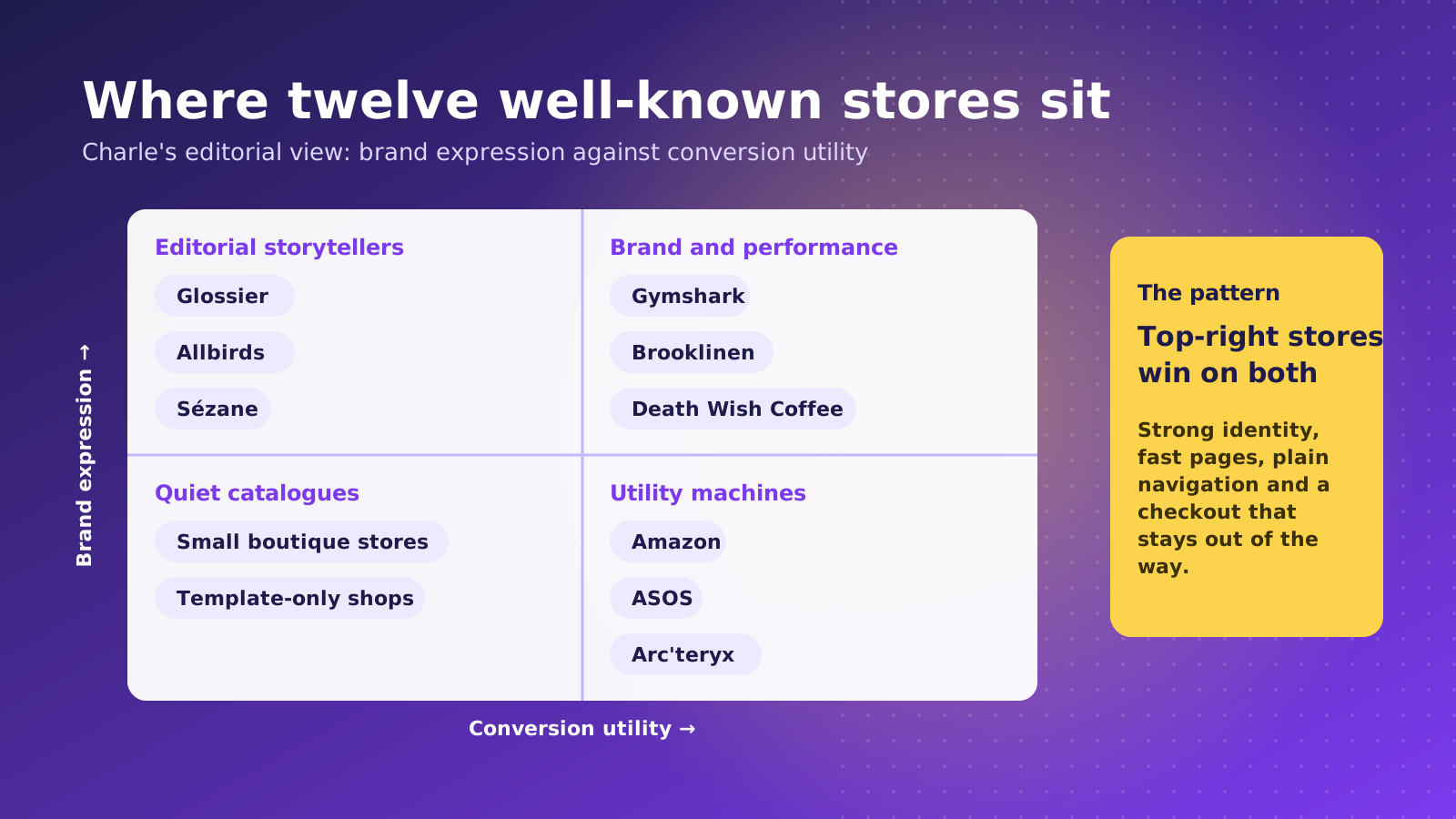
The twelve examples below are chosen because each one is unusually strong at one or more of those jobs. The observations are design analysis based on each store's public storefront and well-documented features, so treat them as lessons rather than performance data. Where a store is known to run on Shopify, we say so, because that matters if you are weighing up a Shopify website design project. For a wider gallery of themes and layouts, our guide to the best ecommerce web designs covers more visual styles.
Design quality also has a measurable commercial side. Our ecommerce conversion rate benchmarks show what a healthy store converts at, which gives you a yardstick for judging whether a redesign is paying off.
12 Ecommerce Websites Examples Worth Studying
Each example below includes what the store does well and one lesson you can apply. They span fashion, beauty, food, home and marketplace retail, because good patterns repeat across categories even when the visual style does not.
Gymshark
Gymshark is one of the best-known Shopify Plus success stories in the UK, and its storefront shows why. Product grids load quickly, models are shown across body types and sizes, and size and fit guidance sits close to the buy button. Drops and restocks are handled with clear stock states, which keeps demand-heavy launches from turning into confusion.
What to copy: Make fit and sizing information impossible to miss on apparel product pages.
Allbirds
Allbirds treats the product page as a place to explain materials, not just sell shoes. Wool, tree fibre and sugar-based foam are each given a short explanation, and the sustainability story is attached to the product rather than hidden on an About page. The layout stays calm, with generous white space and a single clear action.
What to copy: Turn what makes your product different into scannable proof on the page where the decision is made.
Glossier
Glossier is a masterclass in brand-led ecommerce. Soft color, friendly microcopy and customer photography make the site feel like an extension of the packaging. Reviews and user-generated content do much of the persuading, and the navigation is short enough that a first-time visitor is never lost.
What to copy: Use real customer voices as the main persuasion layer, and keep navigation shorter than you think you need.
Brooklinen
Bedding is a hard category to buy online because shoppers cannot feel the fabric. Brooklinen compensates with clear product comparisons, size guidance, bundles and plenty of reviews, so the shopper can compare options without leaving the page. Bundles also lift basket value naturally, which ties into our guide to product bundling examples.
What to copy: If your product is hard to judge online, build comparison and bundle tools into the page.
Death Wish Coffee
Death Wish Coffee proves that a loud, characterful brand can still convert. The skull-and-bold-type identity is used consistently, product pages make subscription ordering easy, and the offer is explained in plain language. The personality is strong, but it never competes with the add to basket button.
What to copy: Let personality shape the tone, but keep the purchase path obvious and boring.
Kylie Cosmetics
Kylie Cosmetics is built for spikes. Product launches send huge bursts of traffic, so the store relies on a simple layout, large imagery and a quick path from launch banner to product to bag. Shade selection is visual, with swatches rather than dropdown text, which makes choosing faster.
What to copy: Use visual selectors such as swatches, not dropdowns, wherever the choice is about how something looks.
Fashion Nova
Fashion Nova shows the high-volume end of fashion retail. Collections are broad, filtering is dense and new arrivals are refreshed constantly, which suits a shopper who browses like they scroll a social feed. It is busy by design, and it works because the underlying filters and sort options are fast and reliable.
What to copy: If you have a large catalog, invest in filtering and sorting before you invest in visual polish.
Blue Bottle Coffee
Blue Bottle keeps things restrained. Clean typography, a tight color palette and short product descriptions let the photography do the work. Subscription and one-off purchase options are presented side by side, so the shopper does not have to hunt for the recurring option.
What to copy: Restraint is a legitimate strategy. Fewer elements on the page means each remaining element carries more weight.
Sézane
Sézane blends editorial content with shopping. Lookbooks, seasonal stories and product pages share a consistent visual language, so browsing feels more like reading a magazine than scanning a catalog. It appears in design galleries such as Siteinspire for good reason.
What to copy: Editorial content can sell, as long as every story leads straight to products.
Arc'teryx
Technical products need technical information, and Arc'teryx delivers it without clutter. Product pages combine clear imagery, feature summaries and detailed specifications, with filters that reflect how outdoor shoppers actually search, such as activity and weather conditions.
What to copy: Match your filters to how customers think about the product, not how your stock system categorises it.
Topicals
Topicals is a good example of a challenger skincare brand using design to build trust. Playful color, plain-language ingredient explanations and real reviews help a new brand feel established quickly. Educational content sits close to the products it supports.
What to copy: New brands can borrow trust from clear education and visible social proof.
Amazon
Amazon is not a template to copy visually, but it is the benchmark for utility. Search is forgiving, delivery promises are shown early, reviews are prominent and the checkout path is short. Shoppers have learned these patterns, which means deviating from them without a good reason adds friction.
What to copy: Learn from Amazon's clarity on delivery, returns and reviews, then express them in your own brand style.
Homepage Patterns the Best Stores Share
Across these ecommerce websites examples, the homepages follow a recognizable pattern. The best ones do not try to say everything. They state what the store sells, show the most important categories and give the shopper a reason to trust the brand, all above or just below the fold.
- A clear value proposition: one sentence that says what you sell and why it is different.
- Category entry points: three to six visual links to the main collections, so shoppers can self-select.
- Bestsellers or new arrivals: a curated product row that proves the catalog is current.
- Social proof: reviews, press logos or customer photography placed before the footer.
- One primary call to action: not five competing banners.
A common mistake is treating the homepage as a billboard for every internal stakeholder. The stores above resist that. When we plan a mobile responsive Shopify design, we start from the homepage hierarchy on a phone, because anything that does not survive a narrow screen was probably not essential.
Product Page Patterns That Convert
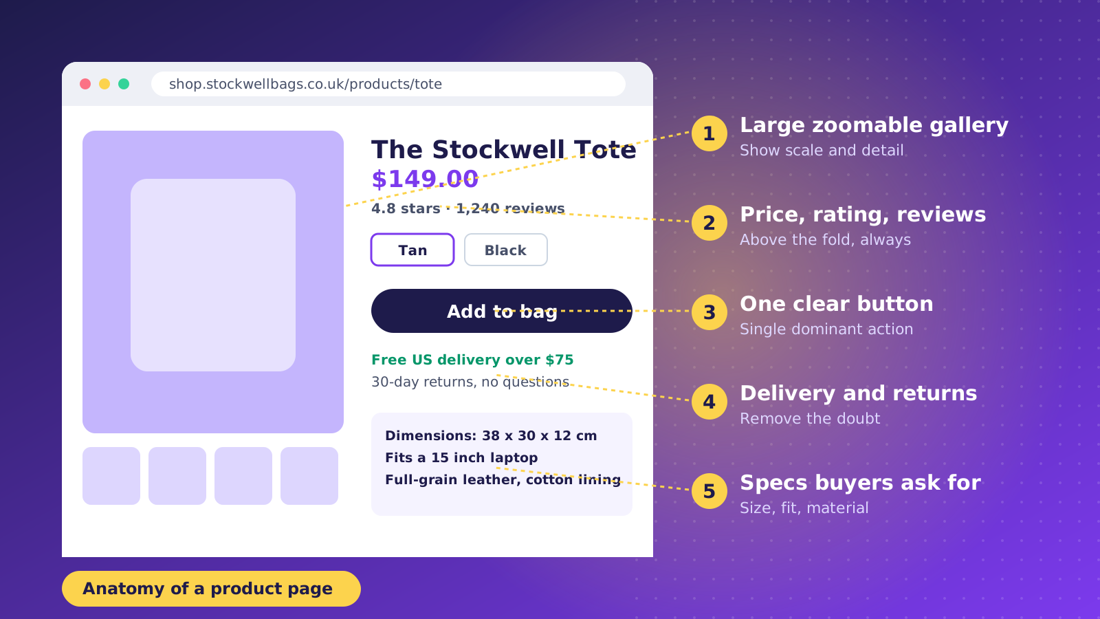
The product page is where the sale is won or lost. Looking across the twelve examples, the strongest pages share a handful of elements, and they appear in roughly the same order every time.
- Large, zoomable imagery that shows scale, detail and the product in use.
- Price, rating and review count close to the product title, so the key facts are visible without scrolling.
- A single dominant add to basket button with variants that are visual where possible.
- Delivery and returns information near the button, not buried in the footer.
- Specifications, size guidance and materials in expandable sections that keep the page tidy.
- Reviews with photos, because they answer the questions the description cannot.
Product copy matters too. Descriptions that explain benefits and answer common questions help both shoppers and search engines, which is why we pair design work with the advice in our guide to optimizing product pages for SEO. Personalised recommendations further down the page can also lift basket size, and our ecommerce personalization examples show how brands do it well.
Navigation, Search and Filtering
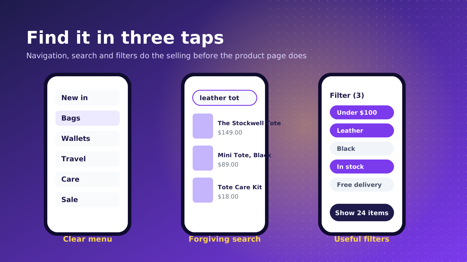
Navigation is the part of ecommerce website design that shoppers notice only when it fails. The stores above keep top-level menus short, use plain category names and make the search bar easy to reach on every page.
Search deserves special attention. A shopper who uses site search is usually further down the buying path than one who browses, so poor results are expensive. Good stores handle typos, show product thumbnails in the suggestions and offer sensible fallbacks when nothing matches. Filtering follows the same principle: offer the attributes customers actually care about, such as size, price, material or color, and show how many results each choice leaves.
Arc'teryx and Fashion Nova sit at opposite ends of the style spectrum, yet both succeed because their filters are fast and reflect how people shop. If your catalog has more than a few dozen products, filtering is not a nice-to-have.
Checkout and Trust Signals
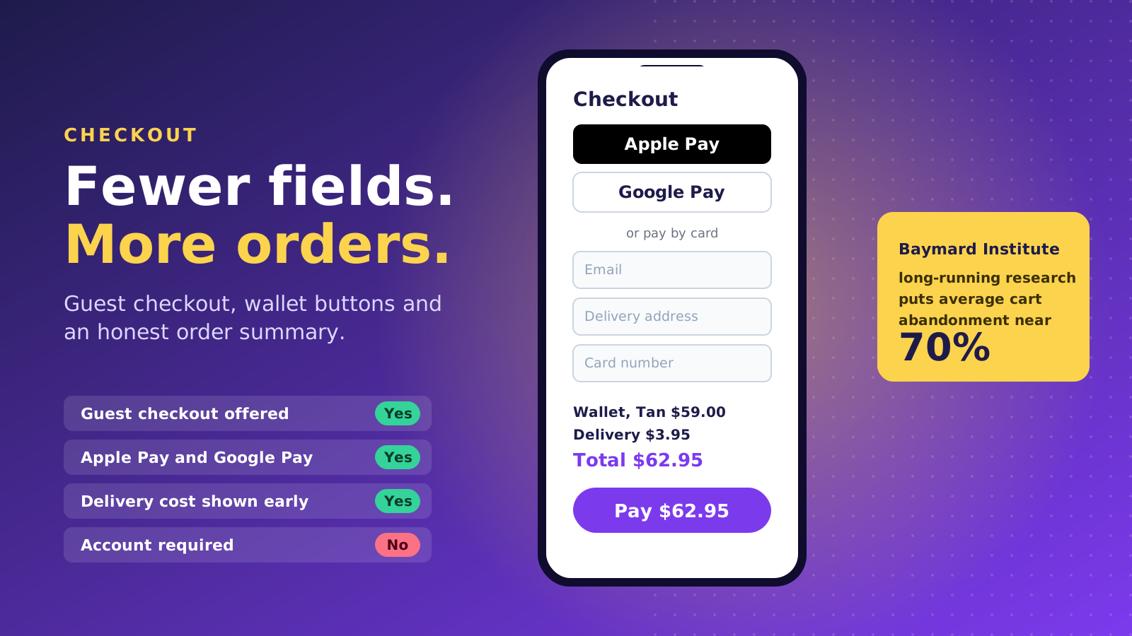
Checkout is where good design meets hard numbers. The Baymard Institute, which has studied checkout usability for years, has long put average cart abandonment at around 70%. Many of the causes are design problems: forced account creation, surprise delivery costs, long forms and a lack of payment options.
- Offer guest checkout, and let returning customers sign in without making it a requirement.
- Show delivery costs and delivery times before the final step.
- Include wallet options such as Apple Pay, Google Pay and Shop Pay so mobile shoppers can pay in a couple of taps.
- Keep the form short, and use address lookup where you can.
- Display returns policy, payment security and contact details close to the pay button.
Shopify's checkout is one reason many brands choose the platform. It is fast, well tested and highly optimized, which means most of the design work happens before the shopper reaches it, in the product page, basket and delivery messaging. Trust signals help in the same way: genuine reviews, clear policies and visible contact details reduce hesitation without adding clutter.
Mobile Experience and Page Speed
Most ecommerce traffic now arrives on a phone, so the mobile experience is the main experience. The best stores design the phone layout first, with thumb-friendly buttons, readable type and imagery that loads quickly.
Speed is part of design. Heavy sliders, autoplay video and stacks of third-party apps can make a beautiful store feel sluggish, which costs both conversions and search visibility. Compress images, limit the number of apps that inject scripts, and test on a mid-range handset rather than a flagship. Faster pages also help search engines crawl your catalog, which supports the technical work in our Shopify SEO guide.
Shopify, Marketplaces and Custom Builds
Several of the examples above, including Gymshark, Allbirds, Brooklinen and Death Wish Coffee, are known Shopify merchants. Others, such as Amazon, run on bespoke platforms built over many years with large engineering teams. The lesson is not that one approach is superior. It is that the platform should match your stage, catalog and budget.
For most growing brands, Shopify offers the best balance of speed to launch, checkout quality, app ecosystem and running cost, with Shopify Plus available when volume or complexity increases. A custom build gives total control but brings higher build and maintenance costs. Marketplaces such as Etsy and Amazon can add reach, but you do not own the customer experience or the data.
If you are deciding between options, our team can help you compare them against your goals through our Shopify Plus agency service. If you are choosing who should design your store, our guide to what a Shopify web designer does is a useful starting point.
How to Use These Examples on Your Own Store
Studying other stores is useful only if it leads to decisions. A practical way to use these ecommerce websites examples is to run a short audit of your own site against the patterns above.
- Pick three examples closest to your category and list what they do that you do not.
- Check your top five product pages against the product page checklist.
- Test your search with ten real queries, including typos.
- Complete a purchase on your own phone and note every point of friction.
- Prioritise changes by effort and likely impact, and test them rather than assuming.
Remember that copying a layout is not the goal. Understanding why a pattern works, and then adapting it to your own customers, is what separates a store that merely looks like a competitor from one that outperforms it. If you would like an expert view on your store, get in touch with the Charle team and we will review it with you.