 Nic Dunn, CEO, Charle Agency
What Shopify Conversion Rate Optimization Actually Is
Shopify conversion rate optimization is the systematic process of increasing the percentage of store sessions that end in a purchase. You measure where visitors drop out, form a hypothesis about why, change something, and check whether conversions moved. That is the whole discipline. Everything else is tactics.
Why Shopify CRO is different from generic CRO
What makes CRO on Shopify different from generic conversion rate optimization is the platform itself. Shopify owns the checkout, so you inherit a checkout process that converts well by default but that you cannot rebuild from scratch unless you are on Plus. The theme system decides how fast your product pages render. The app ecosystem gives merchants personalization, product reviews and social proof in an afternoon, then quietly adds 400KB of JavaScript to every page. Those constraints shape which improvements are available to you, and a lot of generic CRO content ignores them entirely.
What CRO is not
It is not a redesign. It is not a single pop-up that captures email addresses for your newsletter. It is not chasing a number a competitor quoted at a conference. Charle has built and optimized more than 100 Shopify Plus stores, and the pattern is consistent: the stores that improve are the ones that treat conversion rate as an operational metric with an owner, a cadence and a backlog, rather than a project that runs for six weeks and then stops.
Check the traffic before you blame the store
Conversion rate is a ratio, so it moves when either half changes. A store that doubles its traffic with cold prospecting ads will watch conversions fall as a percentage even while sales rise. Search and email visitors buy at several times the rate of paid social buyers, so the same site can post two very different results in the same quarter. We cover the difference in our guide to improving your ecommerce conversion rate.
The Benchmarks That Apply to US Stores
Published conversion benchmarks mix every kind of retailer together, and the blended average will make a healthy store look broken. Use the data that matches your market and your category.
The US market average
US ecommerce conversion rates in the Americas average around 2.96%, according to Shopify's own panel data. Narrower samples that measure small and mid-market retailers report figures closer to 1.6%. The spread between those two results is not a contradiction. It is the difference between measuring every retailer and measuring the retailers big enough to appear in a national panel.
The three Shopify goalposts
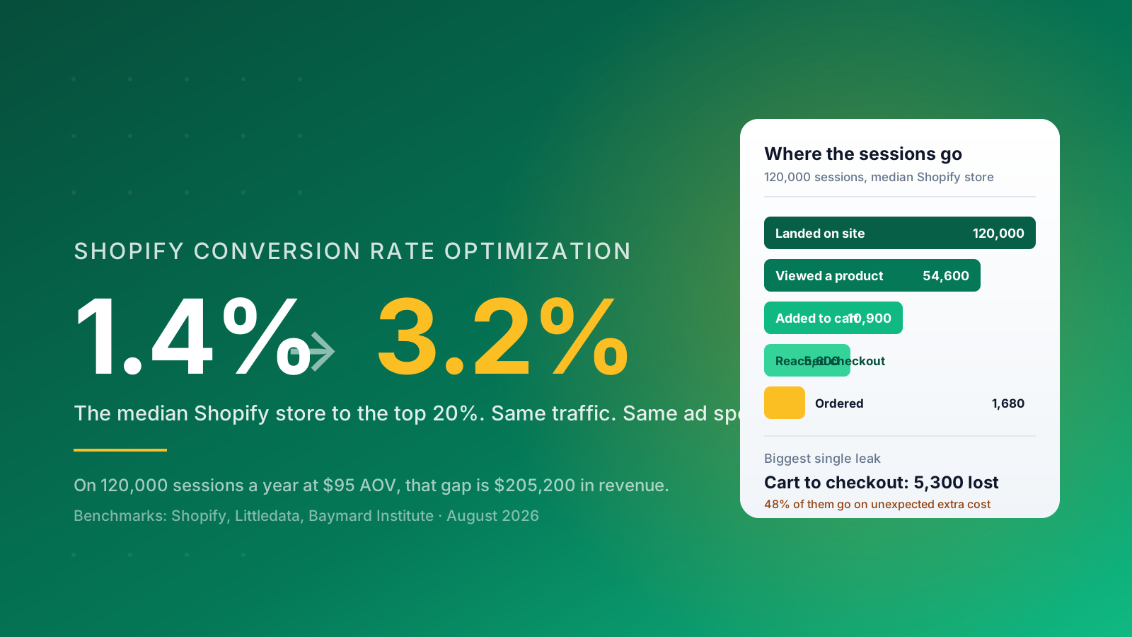
On Shopify specifically, the median store converts around 1.4% of sessions into sales. Clear 3.2% and you are in the top 20% of Shopify stores. Clear 4.7% and you are in the top 10%. Those three numbers are the most useful goalposts in this article, because they are drawn from the same platform you are selling on rather than from a mixed sample of every ecommerce site on the internet.
Your category sets the ceiling
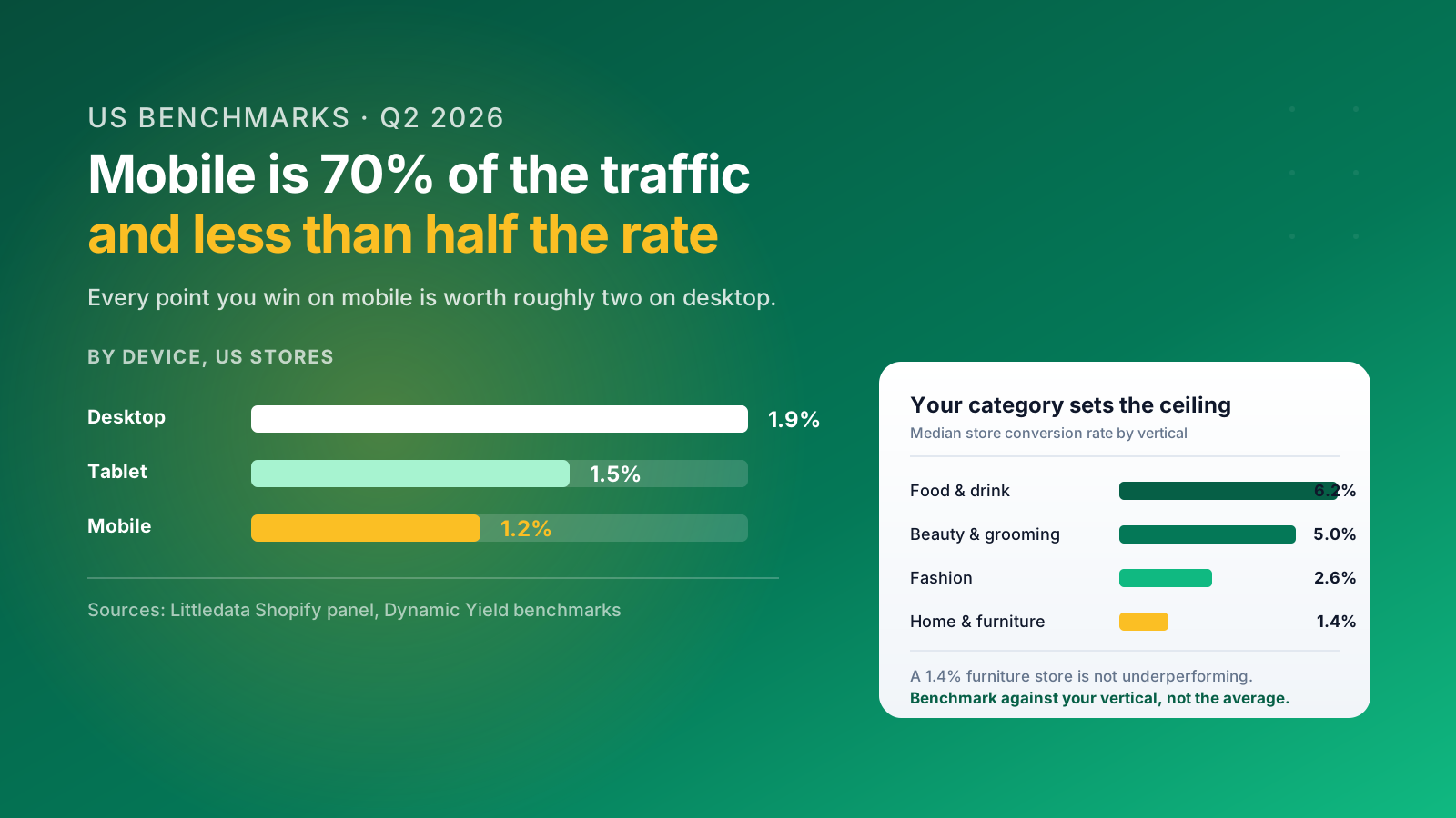
Category moves the number more than anything you do to the site. Food and drink stores average around 6.2%. Beauty and grooming sits near 5.0%. Home and furniture, where the average order value is high and the consideration period runs to weeks, sits around 1.4%. A furniture brand converting at 1.4% is performing to category. A supplements brand converting at 1.4% has a problem. Benchmark against your vertical, and for the full picture across categories our breakdown of what counts as a good ecommerce conversion rate goes deeper.
Device is the split most stores under-react to
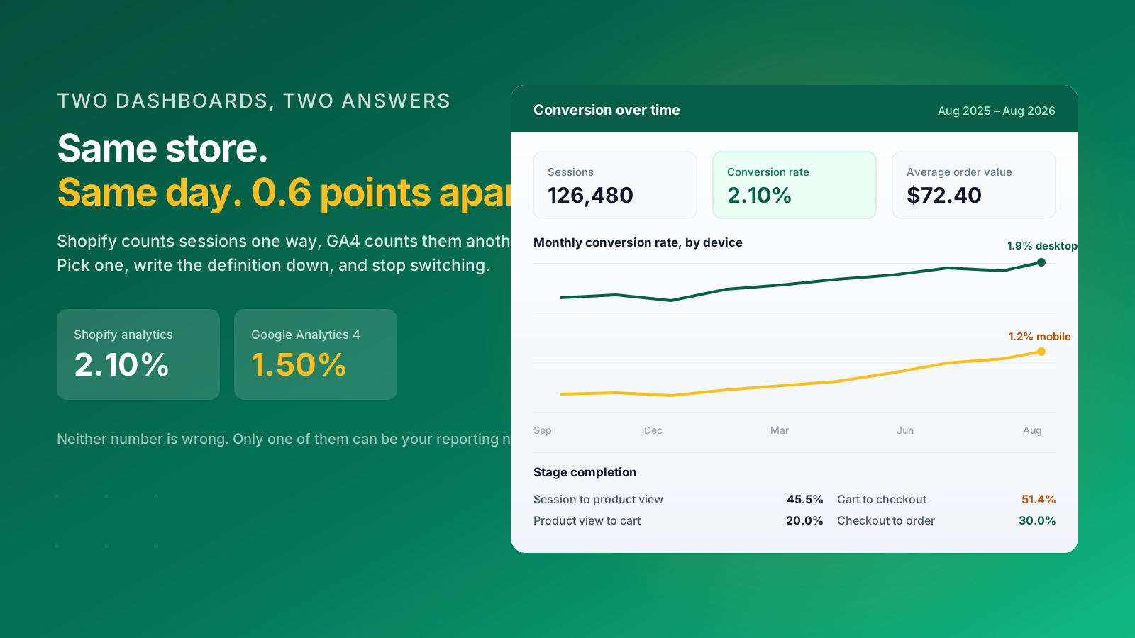
Mobile now carries around 70% of US ecommerce traffic but converts at roughly 1.2%, against 1.9% on desktop for Shopify stores. Every point of improvement you win on mobile is worth more than twice the equivalent gain on desktop, simply because more people are there. Segment every report you build by device before you draw a conclusion from it.
Work Out What One Point of Conversion Rate Is Worth
Before you pick a tactic, price the prize. This single calculation will sort your backlog faster than any prioritization framework.
The formula
Take your sessions for the last 12 months, your current conversion rate and your average order value. Multiply sessions by the conversion rate you are targeting, then by average order value, and subtract what you make today. That is the value of the improvement, expressed in money rather than in percentage points.
A worked example
A store with 120,000 sessions a year, a 1.4% conversion rate and a $95 average order value turns over roughly $159,600. Move that store to 3.2% and the same traffic produces $364,800 in sales. The difference is $205,200 a year, earned without a single extra visitor, and it compounds because you are not paying acquisition costs on any of it.
Price each improvement, not just the goal
Run the same maths on the individual improvements in front of you. If your checkout completion rate is 30% and 5,600 people reach checkout each year, lifting completion to 40% is worth 560 additional purchases, or roughly $53,200 at that average order value. If a homepage hero test might move overall conversion by 0.05%, it is worth 60 orders. Both are real improvements. Only one deserves your next sprint, and the numbers make that call for you rather than the loudest person in the room.
This is also how you decide whether to hire. Nic Dunn, CEO of Charle, puts it plainly: if a single point of conversion rate is worth less than the cost of the work, the honest answer is to go and get more traffic first. CRO earns its keep on stores that already have volume flowing through them. For merchants considering outside help, our explainer on what a CRO agency actually does sets out where the value sits.
The Five Places Shopify Stores Leak
Almost every store we audit loses visitors at the same five points. Working through these areas in order is more productive than working through a list of 25 tactics, because each stage feeds the next.
1. Landing
The visitor arrives and cannot tell within three seconds what you sell or why it is different. Homepages carrying five competing promotions, hero banners with a message that changes every four seconds, and navigation with fourteen top-level items all produce the same outcome. Keep top-level menus to seven items or fewer, use plain-language labels, and give the hero one job. The same rule applies to any landing page you build for a campaign.
2. Product discovery
The visitor is interested but cannot find the right product. Collection pages with no useful filtering, site search that returns nothing for a plural, and category hierarchies built around your internal structure rather than how customers think. Around 15% of visitors use site search, and they convert at a far higher rate than browsers, which makes search quality a disproportionately valuable fix.
3. The product page
Shoppers understand the product but not why it is worth buying now. Value propositions are generic, key features and benefits sit below three galleries of product images, and the reassurance a buyer needs arrives after the doubt rather than before it. Fixing the product page experience is where most stores have the largest addressable gap, because every other stage depends on it.
4. Cart to checkout
The visitor has decided to buy and then meets a cost they were not expecting. This is the biggest single leak on most stores and it is covered in full in the next section.
5. Checkout to order
The customer is committed and the form gets in the way. Mandatory account creation, too many fields, no express payment options, no visible delivery date. Every additional step is another chance to lose the sale.
Find your worst stage before you touch anything
Shopify's own analytics gives you sessions, sessions that reached checkout and sessions that converted, which is enough to identify the weakest of the five areas. Session recordings and heat maps supply the insights behind the numbers by showing what people actually did, and they surface friction points a report never will. Working out where the money leaks takes an afternoon and saves a quarter of misdirected effort.
Checkout Is the Biggest Lever, and the Rules Just Changed
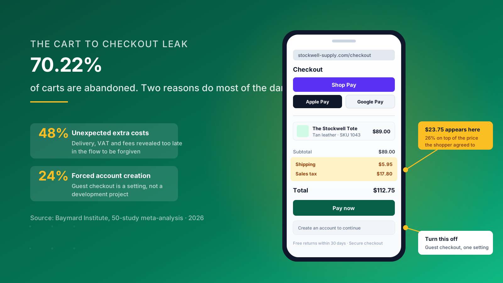
Around 70.22% of ecommerce carts are abandoned, according to Baymard Institute's meta-analysis of 50 separate studies. Cart abandonment at that scale is the single largest pool of nearly-converted revenue in your business, and the reasons people walk are well documented.
What actually causes cart abandonment
Unexpected extra costs are the top cause, cited by 48% of abandoning shoppers. Shipping charges, sales tax and handling fees revealed at the final step feel like a bait and switch even when the amounts are entirely reasonable. Sales tax is added at checkout in the US rather than shown inclusive, which makes the surprise larger than it is elsewhere. Among buyers who would otherwise have completed the purchase, surprise cost at checkout accounts for 39% of abandonment and mandatory account creation for another 24%. Checkout complexity drives away a further 18%. Those four factors explain most abandoned carts on most stores.
The fixes that work
They are unglamorous. Show shipping costs and an estimated delivery date on the product page, not at the final step. State any free shipping threshold in the header and show progress towards it in the cart. Turn guest checkout on, which is a single setting rather than a development project. Enable Shop Pay, Apple Pay and Google Pay so returning customers skip the form entirely. Shop Pay in particular removes most of the typing from a mobile purchase. Test these payment options on a real phone, not a desktop preview.
The August 2026 checkout deadline
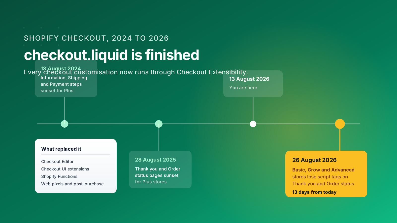
The platform context has shifted underneath all of this. Shopify retired checkout.liquid for the Information, Shipping and Payment steps in August 2024, and sunset it for the Thank you and Order status pages for Plus stores on 28 August 2025. Script tags on those same pages are sunset for Basic, Grow and Advanced stores on 26 August 2026. If your store still relies on a script tag to inject anything into the post-purchase pages, it stops working this month.
What Checkout Extensibility gives you instead
The replacement is the drag-and-drop Checkout Editor, checkout UI extensions, Shopify Functions for discounts and delivery logic, web pixels for tracking, and post-purchase extensions for upsells. You get defined slots that survive Shopify's own updates rather than bespoke code that breaks every release. Treat the migration as a conversion project rather than a compliance chore, because a broken order status page costs you repeat purchases from your best customers. Our Shopify checkout services cover the migration path.
Speed, Mobile and the 70/30 Problem
Speed is not a technical nicety, it is a conversion input with a measurable exchange rate. Google and Deloitte found that a 0.1 second improvement in mobile site speed lifted retail conversion rates by 8.4%. At the other end, pages that take five seconds to load convert at around 1.08%, which is well below the platform median.
The three causes of a slow Shopify store
Check them in this order. First, apps. Every app that injects a script tag runs on every page, including the ones where it does nothing. Audit your installed apps quarterly, remove anything you are not actively using, and check whether the survivors load their assets asynchronously. Second, product images. Photography uploaded at 4000px and served through a theme that does not use responsive image sizes will dominate your page weight, and images are usually the largest single component. Third, the theme. Older themes carry jQuery, multiple icon fonts and render-blocking CSS that modern Shopify themes have shed.
The mobile problem is bigger than speed
Roughly 70% of sessions arrive on a phone and convert at less than half the desktop rate, and the gap is mostly design rather than intent. Critical purchase triggers sit beneath image carousels, banners and pop-ups. Tap targets are too small. Sticky headers eat a third of an already small viewport. Filters open a full-screen overlay that loses the customer's place. None of that shows up in a desktop preview, which is why so many stores ship a broken mobile user experience without noticing.
Fix the mobile product page first
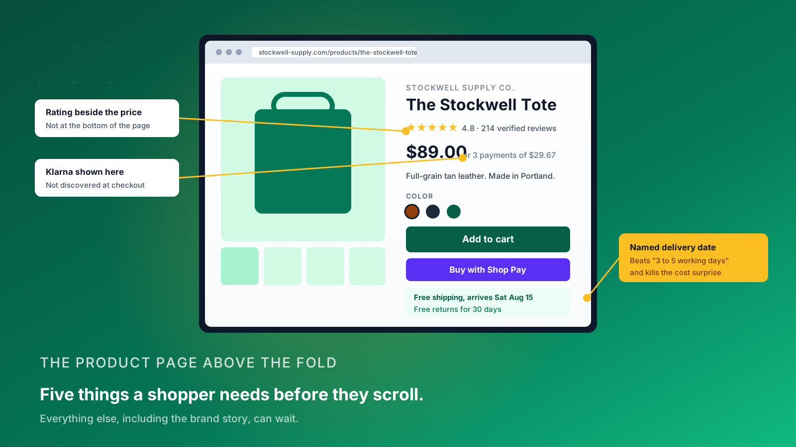
A shopper on a phone should see the product image, the name, the price, the delivery promise and the add-to-cart button without scrolling. Everything else, including your brand story and long-form content, can wait. Sticky add-to-cart bars are one of the few changes that produce reliably positive results across almost every store type, and they take an afternoon to implement.
Trust, Proof and the Objections That Stop a US Shopper
Trust is what a shopper substitutes for the ability to pick the product up. If your store is unfamiliar, every unanswered question becomes a reason to leave and buy from a brand they already know.
Customer reviews do the heaviest lifting
Put the star rating and review count next to the product title or price rather than at the bottom of the page, because that is where the hesitation happens. Verified buyer badges and customer photographs outperform text-only product reviews, particularly in fashion and beauty where fit and color accuracy are the recurring doubts. Customer testimonials that name a specific outcome beat generic five-star praise, and this kind of social proof works hardest on the products with the highest price.
Delivery and returns are trust signals, not logistics copy
US customers expect a named delivery window, not "3 to 5 business days" in gray text on a policy page. State the cutoff time for next-day shipping on the product page. Write your returns policy in plain English, put the window in the first sentence, and say who pays for the return label. A hassle-free returns policy removes the perceived risk of buying a size you are unsure about, and it remains one of the cheapest conversion improvements available to any merchant.
Show payment options before checkout
Buy-now-pay-later adoption keeps climbing, so payment reassurance is worth more than it used to be. Showing Affirm, Klarna or Afterpay availability on the product page rather than at checkout gives price-sensitive buyers permission to add an item they were hesitating over. The same logic applies to discounts: if a first-order discount exists, say so before the cart rather than hiding it in a pop-up.
The opposite failure
Too much social proof creates decision paralysis, and urgency tactics applied to evergreen stock train customers to distrust everything else on the page. A countdown timer that resets when you refresh is worse than no timer at all.
Product Discovery and Personalization
Personalization earns its reputation when it helps someone find the right product faster, and loses it when it becomes a recommendation carousel nobody clicks.
Start with site search
Search users are a small share of visitors but a large share of sales, because searching is a declaration of intent. Check what your search returns for your top 50 queries, including misspellings, plurals and the words customers use rather than the words on your labels. Zero-result searches are a free list of the products and accessories people want and cannot find, and clearing that list is often the fastest conversion win available.
Then fix your collection pages
Filtering by the attributes that drive the decision, size, color, price band and material, does more for conversion than any recommendation engine. Surface bestsellers rather than the default alphabetical order. Simplify your categories so a shopper reaches a product in two clicks rather than four.
Where product recommendations earn their place
Two moments: on the product page as an alternative when the item is wrong, and in the cart as a genuine complement or an accessory. Rules-based recommendations are fine to start with. AI-powered engines that read browsing patterns, product attributes and real-time signals produce better results at scale, but they need enough traffic and order history to learn from, which brings us back to volume.
Abandoned cart recovery
This is the highest-return automation on most Shopify stores. Many abandoned carts are attached to a known email address, which makes a three-message flow, a clear reminder, then a reason to return, then a modest incentive, one of the few tactics that pays for itself in the first week. Add a newsletter capture that earns the address honestly and those flows get more to work with. Our Klaviyo team builds these flows regularly.
How to Test on Shopify When You Do Not Have the Traffic
Here is the part most Shopify CRO content leaves out. Almost every guide tells you to split test everything. Almost none of them tell you how much traffic a valid test requires, and the answer disqualifies the majority of Shopify stores from testing small changes at all.
The arithmetic nobody publishes
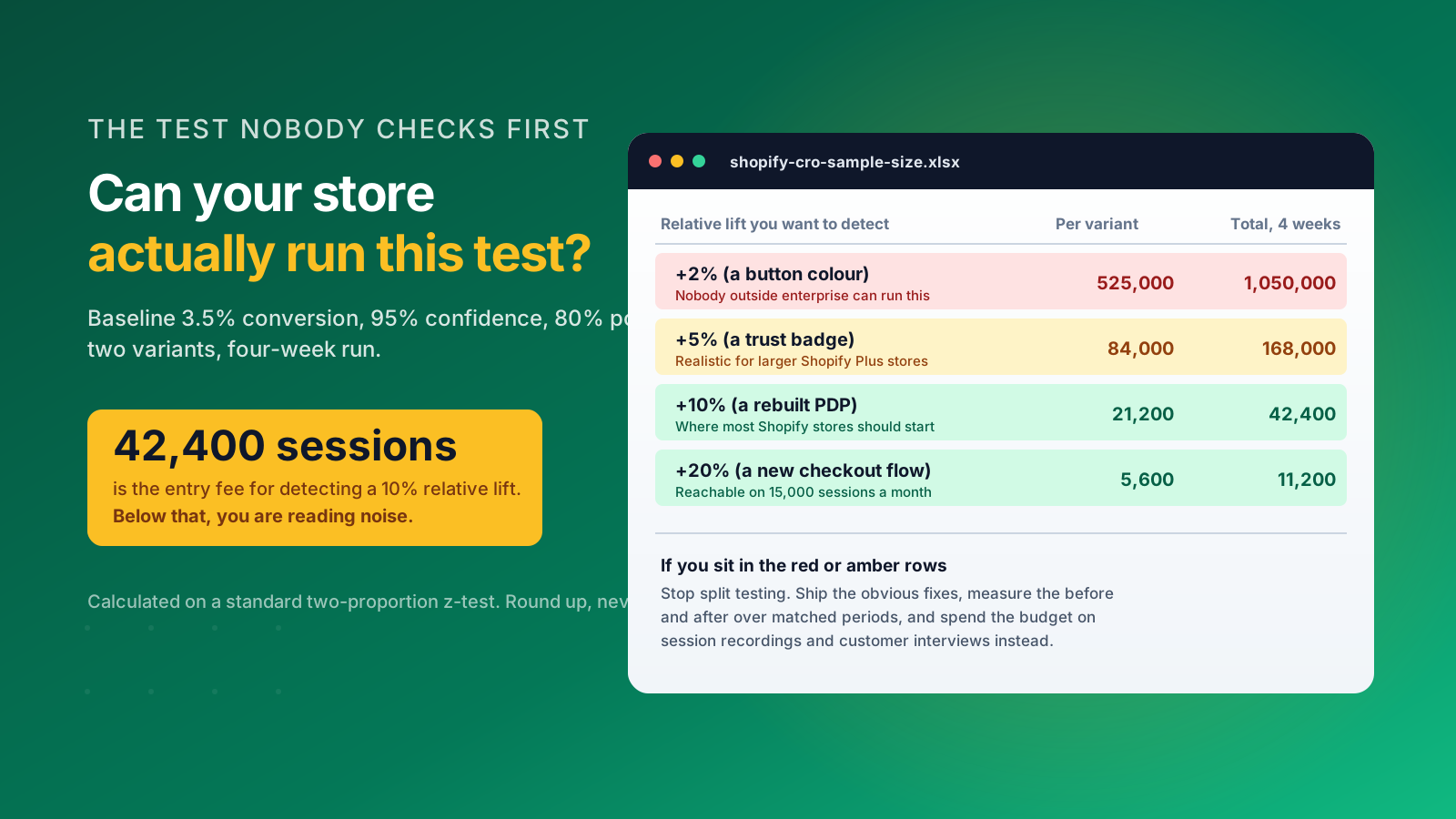
At a 3.5% baseline conversion rate, 95% confidence and 80% statistical power, detecting a 10% relative lift needs roughly 21,200 visitors per variant. That is 42,400 sessions to complete one two-variant split test. Tighten the effect you want to detect to 5% and the requirement climbs past 84,000 per variant. Chase a 2% lift, the sort of change a button color might produce, and you are into hundreds of thousands of sessions per variant.
What that means for a real store
A store doing 15,000 sessions a month can run a four-week test that reliably detects a 20% relative lift. It cannot detect a 5% lift inside a year. That is not a limitation of the tool, it is arithmetic, and no amount of dashboard confidence intervals changes it. Tests stopped early because the numbers looked good are the single most common way stores convince themselves a change worked when it did nothing.
Three ways to work around low traffic
Make bigger changes, because larger effects need fewer sessions to detect. Concentrate the test on your highest-traffic landing pages rather than running it site-wide. And where you cannot test at all, ship the change the evidence already supports and measure the results as a before-and-after over matched periods, controlling for season and traffic mix.
Spend the budget on research instead
Twenty session recordings of people abandoning your cart will tell you more than an underpowered test. Five customer interviews will surface the objection your product descriptions never answer. Both produce insights you can act on this week rather than a result you cannot trust in three months. When you do have the volume to test properly, our guide to A/B split testing and our roundup of the best A/B testing tools for Shopify cover the mechanics.
Measuring It Without Fooling Yourself
Two dashboards will report two different conversion rates for the same store on the same day, and knowing why saves a lot of arguments.
Why Shopify and GA4 disagree
Shopify reports a session-based conversion rate: orders divided by online store sessions, where a session expires after 30 minutes of inactivity. Google Analytics 4 counts sessions differently, attributes across a longer window, and by default reports on a data stream that may or may not include your checkout. Neither is wrong. Pick one as your reporting number, write down the definition, and hold every improvement to that same measure. Switching sources mid-quarter is how teams accidentally report a win.
Watch the metrics underneath the headline
Add-to-cart rate, cart-to-checkout rate and checkout completion rate are the metrics that tell you which stage moved. A conversion rate that improved because checkout completion rose is a different story from one that improved because paid ads paused. Average order value and returns rate matter too. A discount-led lift in conversions that drags order value down and returns up is not a win, it is a transfer of margin.
Segment before you conclude
Split the data by device at minimum, and by traffic source where you can. A change that helps mobile and hurts desktop looks flat in aggregate, and that is one of the more common reasons a promising improvement gets abandoned. New and returning customers often respond to the same page in opposite directions, so separate them before you judge engagement.
Give the number a cadence
Review conversion rate monthly against the same month last year rather than against last month, because seasonality will otherwise dominate the reading. Weekly reviews of a metric this noisy generate more meetings than insights, and they encourage people to act on random variation.
A 90-Day Shopify CRO Plan
If you are starting from nothing, this sequence gets a store from guessing to compounding within a quarter.
Weeks 1 to 2: measure
Establish the baseline conversion rate by device and by traffic source. Pull the stage-by-stage funnel from Shopify analytics. Install session recording and watch twenty abandonments end to end. Calculate what one point of conversion rate is worth to your business so every later decision has a price attached to it.
Weeks 3 to 6: clear the obvious friction
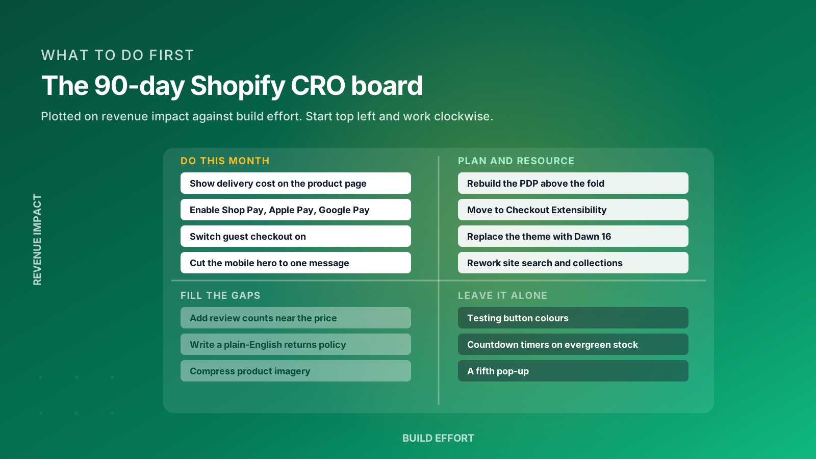
Show shipping costs and delivery date on the product page. Enable guest checkout and every express payment method. Cut the mobile hero to a single message. Move customer reviews and star ratings up next to the price. Audit and remove unused apps. None of these actions need a test, because the evidence is already unambiguous and the effort is low.
Weeks 7 to 10: fix the worst stage
Take whichever funnel stage showed the largest drop and rebuild it properly. For most stores that is the product page above the fold or the cart-to-checkout transition. This is where your design and development time goes, and it produces the results you will still be seeing next year.
Weeks 11 to 13: build the loop
Set up the reporting cadence, write down the measurement definitions, and start a prioritized backlog scored on revenue impact against effort. If your traffic supports it, launch your first properly powered split test. If it does not, schedule the customer interviews instead.
The stores that keep improving are the ones that reach week 13 with a backlog rather than a finished project. If you would like help working through it, our ecommerce agency team runs this process with Shopify and Shopify Plus brands. Get in touch and we will look at your funnel with you.